Core Web Vitals for Aesthetics: Solving the Speed Paradox of High-Resolution Image Galleries

What to Know
- MedSpa websites are built around photography. Google’s ranking algorithm penalizes slow image loading. These two facts create a specific technical problem most practices are losing search visibility over without knowing it.
- The before/after gallery is the most important trust asset on a MedSpa website. It’s also, almost without exception, the most technically destructive page on the site.
- The fix is not removing the photography. It’s removing the technical overhead from delivering it. The same image at the same visual quality can be 80 to 90% smaller when served correctly.
The practices with the best clinical photography documentation are often the ones with the worst Core Web Vitals scores. That is the paradox. It is solvable.
Google’s “Speed Grades” and Your Ranking
The Big Idea: Google officially grades your website on “Core Web Vitals”—a fancy term for how fast and stable your site feels to a patient. If your site is slow, Google hides you from potential clients.
Google tracks three specific “Vital” signs:
- First Impression Speed (LCP): How fast your main photo (usually the hero image) appears. If it takes longer than 2.5 seconds, you’re failing.
- Visual Jitters (CLS): Does the page “jump” while loading? Patients hate it when a button moves right before they tap it. Google scores this stability.
- Tap Response (INP): When a patient clicks a gallery image, does it open instantly or lag? Slow responses kill conversions.
Why it matters: In a crowded local market, Google uses these grades to decide who gets the top spot. A “Poor” grade means you’re handing patients to the competitor next door.
The Speed Paradox: Photos vs. Performance
The Big Idea: To sell aesthetic treatments, you need high-end photography. But those same high-res photos are often the exact things dragging your website’s speed into the mud.
Why your site is struggling:
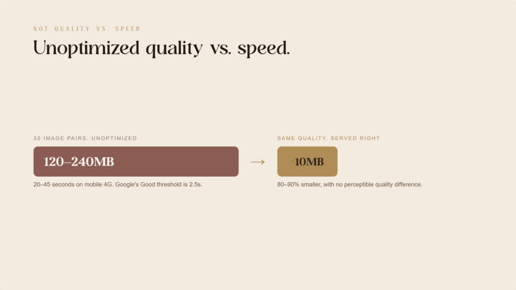
- Heavy Lift: A professional before-and-after shot can be 15MB. Multiply that by 30 results, and your page becomes a digital anchor.
- Mobile Pain: Most patients browse on phones. A page that takes 40 seconds to load on a 4G connection is a page that never gets seen.
- The Solution: You don’t have to delete your photos. You just need to deliver them smarter. Optimized images look identical to the naked eye but load 90% faster.
The paradox is not between quality and speed. It’s between unoptimized quality and speed. The same image at the same visual quality, in the right format, at the right size, with the right loading strategy, can be 80 to 90% smaller. The solution is not removing the photography. It’s removing the technical overhead from delivering it.
Why Is the Hero Image Almost Always the LCP Problem?
On a typical MedSpa website, the hero image is the Largest Contentful Paint element: the browser records how long the largest visible element took to render. If the hero image loads slowly, LCP scores poorly.
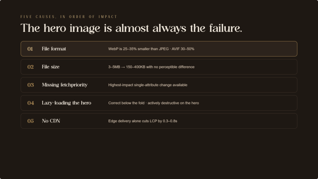
Five factors most commonly cause hero image LCP failures, in order of impact:
- File format. Most MedSpa websites serve JPEG hero images. WebP delivers equivalent quality at 25 to 35% smaller file sizes. AVIF delivers 30 to 50% smaller than JPEG. Switching the hero to WebP alone typically reduces LCP time by 0.5 to 1.5 seconds on mobile.
- File size. An uncompressed hero image at 3 to 5 megabytes is the single largest contributor to poor LCP. Properly compressed and converted to WebP, it can typically reach 150 to 400 kilobytes with no perceptible quality difference.
- Missing fetchpriority=”high” attribute. Adding this to the hero image tag tells the browser to load this image before other resources. One of the highest-impact single-attribute changes available for LCP improvement.
- Lazy loading applied to the hero image. Lazy loading is correct for below-the-fold images. It’s destructive when applied to the hero, which is already in the viewport on page load. If a performance plugin has applied lazy loading sitewide without excluding the hero, it’s actively worsening LCP.
- No CDN. Images served from the origin server without a Content Delivery Network travel from a single location to every patient’s browser. CDN distribution reduces travel distance and can reduce LCP by 0.3 to 0.8 seconds on its own.
How Do Before/After Galleries Cause Visual Jitters (CLS)?
If your gallery page “jumps” or shifts as photos load, it’s because the browser didn’t know how much space to save for them. This creates a frustrating experience for patients, especially on mobile, and Google penalizes this lack of stability.
The Action: Ensure your gallery plugin or website settings explicitly define the width and height of every image. This forces the screen to reserve the correct space before the photo even appears, keeping the page perfectly still.
What Image Format and Compression Strategy Should a MedSpa Use?
You can have high-resolution results without the massive file sizes. By using modern image formats and smart compression, your site will load significantly faster while looking identical to the patient.
The Action: Instruct your team to serve images in WebP or AVIF formats instead of standard JPEGs. These modern formats are 30% to 50% smaller. Additionally, set target file sizes: under 400kb for your main hero photos and under 150kb for individual gallery shots.
The Business Benefit: “Responsive sizing” ensures a phone user isn’t forced to download a massive desktop-sized image. This saves data and makes your site feel “instant” on mobile devices.
How Should Before/After Gallery Pages Be Structured?
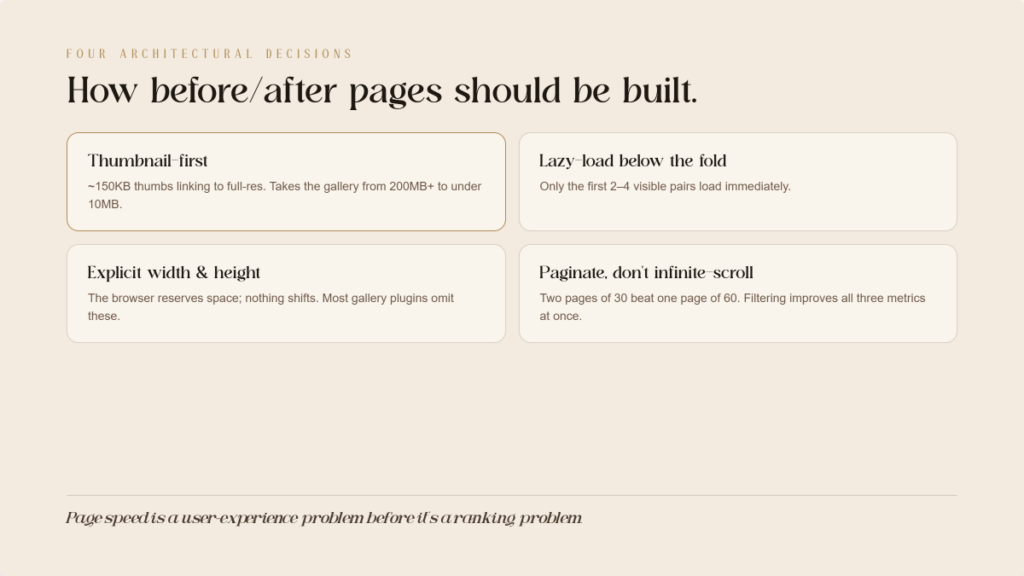
A gallery with dozens of photos shouldn’t try to load everything at once. Smart structuring allows the page to load the first few images immediately while deferring the rest until they are needed.
The Action: Ask your developer to implement “lazy loading” for any photos below the initial screen. You should also use a “thumbnail-first” setup, where small, fast-loading images are shown first, and the full-resolution version only loads if a patient clicks to see more detail.
The Business Benefit: This reduces the initial data “weight” of your gallery from hundreds of megabytes to less than ten, ensuring patients don’t abandon the page because it’s taking too long to load.
For Your Web Developer (Technical Details)
These technical instructions and code snippets should be shared with your development team to implement the improvements mentioned above.
1. Prevent Layout Shifts (CLS)
Browsers need explicit dimensions in the website settings to reserve space. Without them, the background workload shifts the layout during render.
<!– CLS-preventing: explicit dimensions –>
<img src=”before-after-morpheus8.webp”
alt=”Morpheus8 before and after results”
width=”800″
height=”600″>
2. Implement Modern Formats and Responsive Sizes
Use the <picture> element to handle format selection (AVIF/WebP) and the srcset attribute to serve appropriate resolutions based on the user’s screen width.
<picture>
<source srcset=”hero-image.avif” type=”image/avif”>
<source srcset=”hero-image.webp” type=”image/webp”>
<img src=”hero-image.jpg” alt=”MedSpa treatment results”
width=”1440″ height=”800″ fetchpriority=”high”>
</picture>
<img
src=”before-after-medium.webp”
srcset=”before-after-small.webp 480w,
before-after-medium.webp 800w,
before-after-large.webp 1200w”
sizes=”(max-width: 600px) 480px, (max-width: 900px) 800px, 1200px”
alt=”Morpheus8 results” width=”1200″ height=”900″>
3. Optimization and Delivery Infrastructure
Ensure the hero image bypasses lazy loading and uses fetchpriority=”high”. All images should be served via a CDN rather than directly from the main storage to reduce travel distance. Use loading=”lazy” strictly for images appearing below the fold.
What WordPress Solutions Address These Issues?
For WordPress, which powers most MedSpa websites, the optimization stack is well-developed.
- Image optimization plugins: ShortPixel, Imagify, and EWWW Image Optimizer handle format conversion to WebP and AVIF, compression, and automatic serving of optimized images. Any of the three, configured correctly, handles the format and compression layers without manual intervention.
- Performance and caching plugins: WP Rocket (premium), LiteSpeed Cache (free for LiteSpeed servers), and W3 Total Cache handle page caching, lazy loading configuration, and JavaScript minification. WP Rocket includes a configuration option to exclude the LCP image from lazy loading. Configure this specifically. Most sites leave it unconfigured.
- CDN integration: Cloudflare (free tier available), BunnyCDN, and KeyCDN integrate with WordPress performance plugins to serve static assets from globally distributed edge servers. Cloudflare’s Polish feature automatically converts and compresses images served through its CDN.
For Squarespace and Wix: platform-level optimization is more limited but improving. Both support WebP delivery and lazy loading natively. Standard page configurations generally pass Core Web Vitals thresholds, though with less granular control than WordPress.
How Should a MedSpa Diagnose Its Current Performance?
Three tools provide everything needed to identify and prioritize problems:
- Google PageSpeed Insights (pagespeed.web.dev) provides an immediate LCP, CLS, and INP score for any URL, with specific diagnostic information about which elements are causing failures. Run the homepage, the before/after gallery page, and the top two or three treatment pages.
- Google Search Console Core Web Vitals Report shows field data from actual users visiting the site. Pages flagged as Poor are actively affected in rankings. This is the primary diagnostic tool for understanding the scope of the problem across the full site.
- Chrome DevTools Performance Panel provides developer-level analysis. For practices with a web developer, the LCP element identification and the Network panel’s waterfall view show which resources are loading when and how long each takes.
What Implementation Priority Fixes the Most Damage First?
Sequence these by impact:
- Priority 1: Hero image (LCP). Convert to WebP or AVIF. Compress to under 400 kilobytes. Add fetchpriority=”high”. Remove lazy loading if present. Specify dimensions. This single intervention typically moves LCP from Poor to Needs Improvement or Good.
- Priority 2: Sitewide image dimensions (CLS). Audit every image element for missing width and height attributes. Add explicit dimensions or implement aspect-ratio CSS. Eliminates the majority of CLS across all pages.
- Priority 3: Gallery page lazy loading and pagination (LCP and CLS). Implement loading=”lazy” on all below-fold gallery images. Add pagination or category filtering to limit images per page load.
- Priority 4: Format conversion and compression sitewide (LCP across all pages). Install an image optimization plugin to convert all existing images and new uploads to WebP or AVIF with appropriate compression.
- Priority 5: CDN and caching (LCP across all pages). Implement Cloudflare or a comparable CDN. Configure page caching. Enable browser caching headers for static assets.
The Bottom Line
The before/after gallery is not the enemy of page speed. An unoptimized before/after gallery is.
Every high-resolution before/after image on a MedSpa website can be delivered in a format that’s 80% smaller, loads in a fraction of the original time, and produces zero CLS. Without any visible difference in image quality for the patient looking at it.
The practices that solve this problem aren’t just improving their Google rankings. They’re delivering a faster, more stable experience to the majority of website visitors who arrive on mobile. Page speed is a user experience problem before it’s a ranking problem.
The solution stack is documented. The tools are available. In most local MedSpa markets, the competitive implementation gap is wide open. The practice that passes Core Web Vitals across its gallery and treatment pages is the exception. The practices in the Poor category are the rule.
Fix the images. Win the technical ground. Let the photography do what it’s supposed to do.
ready to grow & scale











more
about us
For brands looking for a branding, website and social media facelift...
The Aesthetic Website

learn more
For brands looking to SCALE & GROW their existing aesthetic business with more booked appointments...
The Aesthetic Accelerator

learn more
The client retention app for brands looking to maximize their client lifetime value and increase member retention
Juvvia




we are the creators of




REQUEST BETA ACCESS
follow us
chat with us
A data-driven performance marketing agency dedicated to helping aesthetic businesses scale and grow...
We Are LeadShark System

learn more

